sofi logo mark
SoFi

Web UX Design System

Discover

Background

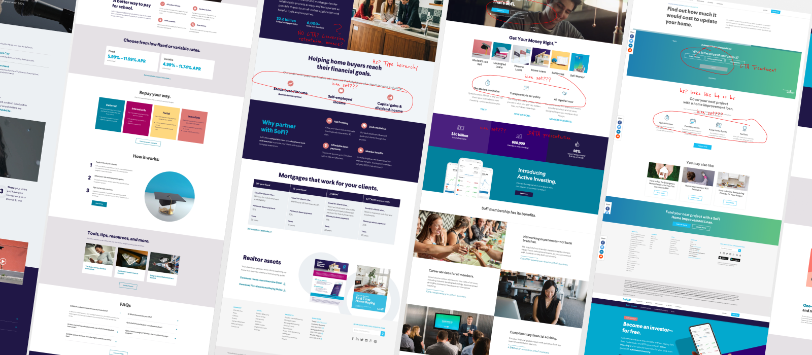
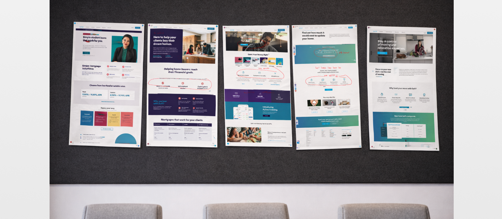
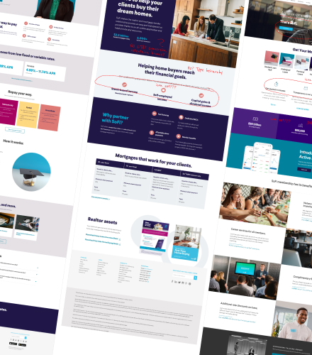
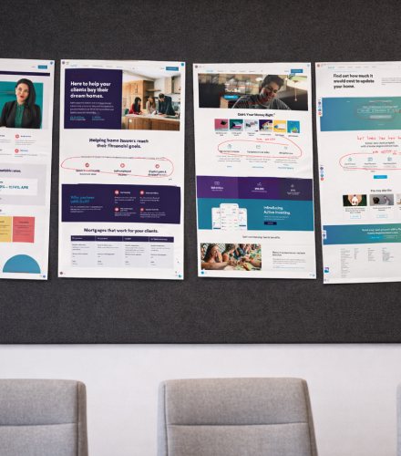
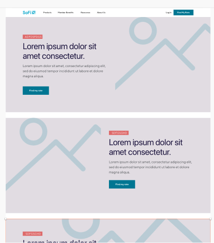
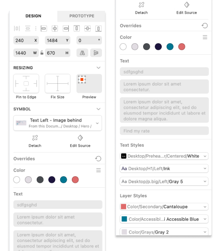
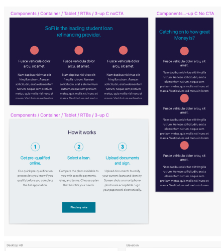
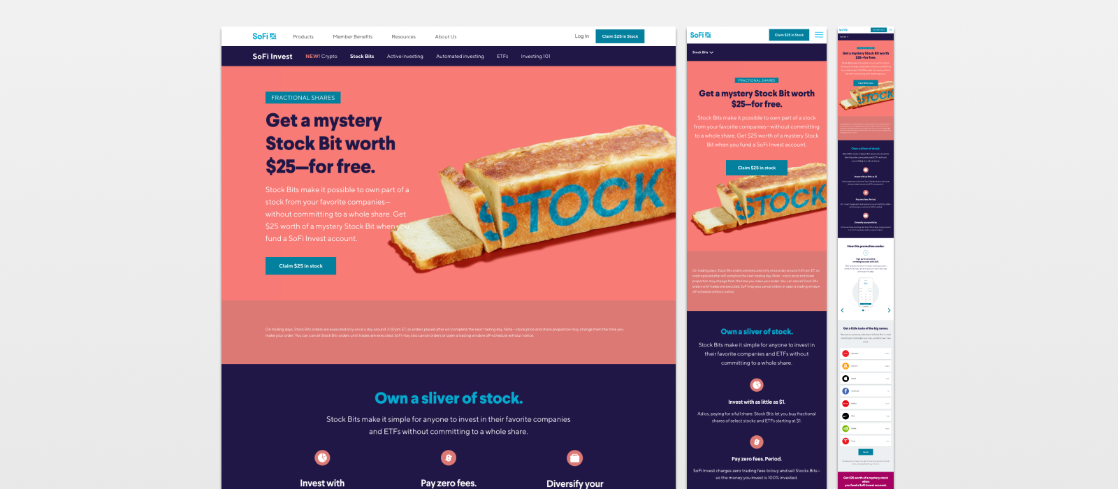
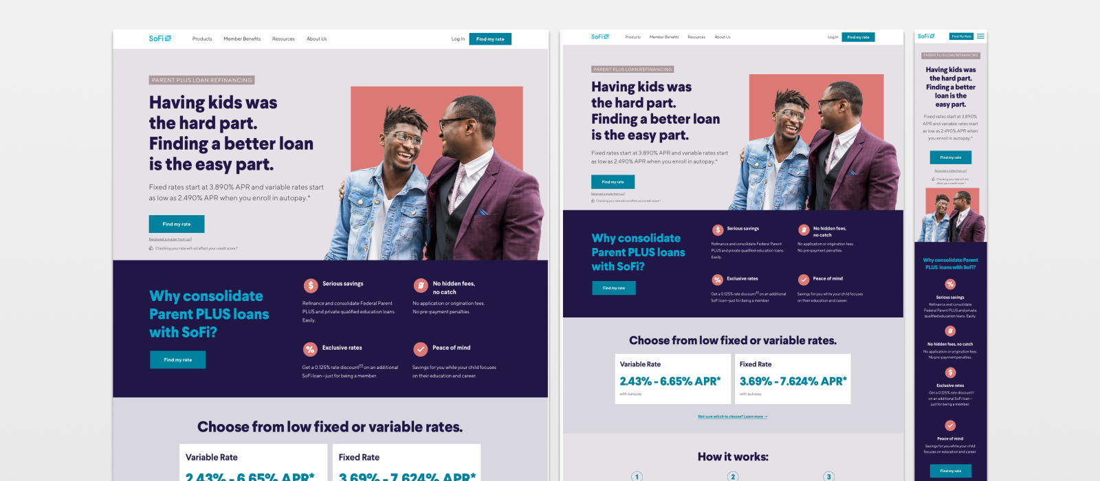
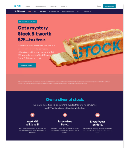
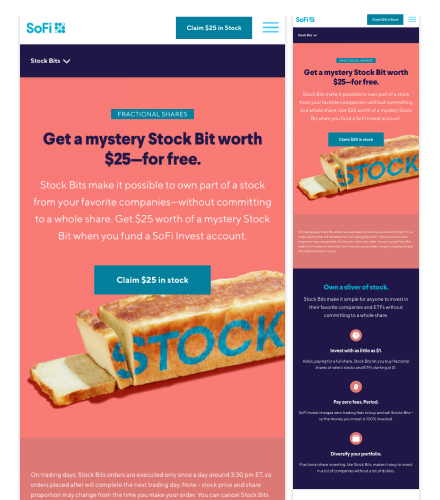
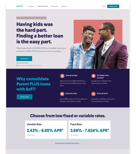
When I joined SoFi, the company was scaling quickly—new products, new features, and constant updates across web and mobile.

But the experience wasn’t scaling with it.

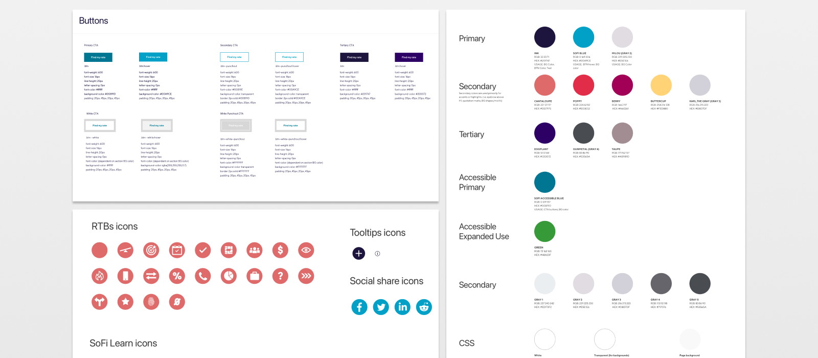
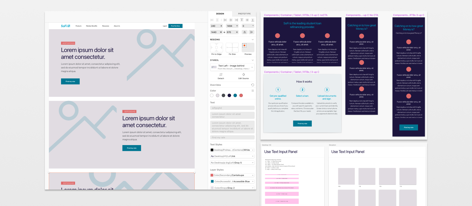
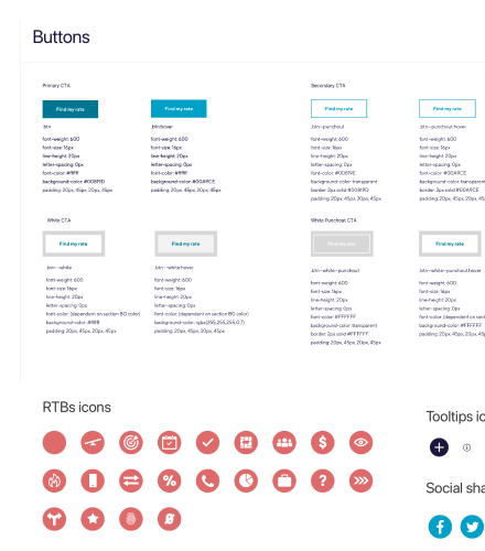
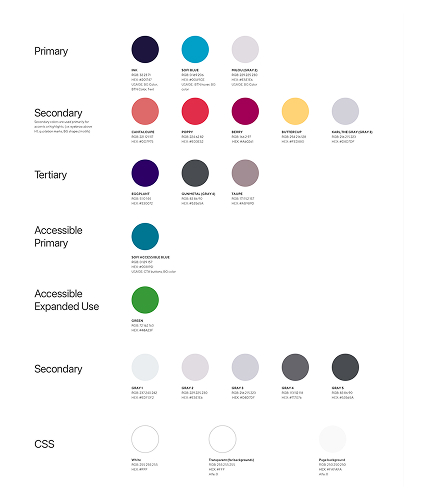
Design patterns had evolved in silos, creating inconsistencies across the product and making it harder for teams to move quickly while maintaining quality.

Date: 2019

My Role: Interim Director
UX – Web

Contributions: Led various initiatives including home page redesign, social media direction/vendor direction, and developed new design system for web UX team.

Problem / Jobs to Be Done

As the product expanded, teams were solving similar problems in different ways—leading to duplicated effort, slower delivery, and a fragmented user experience.

How might we create a unified design system that enables faster product delivery while maintaining a consistent, high-quality experience across SoFi’s platform?

Research Methods
  • Rapid site audit to assess inconsistencies across web experiences
  • Pattern analysis to identify common UI and interaction breakdowns
  • Stakeholder alignment across product, engineering, and marketing
  • Review of existing app and brand systems to ensure cross-platform consistency
Constraints, Risks & Blind Spots
  • Compressed timeline while supporting active product launches
  • Siloed team structures creating inconsistent patterns and approaches
  • Risk of over-standardization limiting flexibility for new products
  • Adoption risk if teams didn’t see immediate value in the system
  • Need to align web, app, and brand without a single system owner

Design

Ideate

The audit revealed a core issue: teams were working in silos, resulting in inconsistent patterns and duplicated effort.

I analyzed the work to identify common patterns and broke them down into foundational elements—establishing a clear starting point for systemization.

Building the System

From those insights, I rebuilt the system from the ground up—creating a scalable, component-based framework with responsive layouts and reusable patterns.

Design styles were aligned with both the app and brand teams to ensure consistency across the broader ecosystem.

Prototyping in Practice

While leading the team, I remained hands-on—applying the system directly to new product work.

This allowed us to test and refine the system in real-time across launches including:

  • Stock Bits (fractional investing)
  • Loan products
  • Insurance experiences

DEVELOP

Testing & Iteration

Applying the system to live product work created immediate feedback loops.

We refined components, patterns, and layouts based on real usage—ensuring the system remained flexible while improving consistency.

Handoff

I worked closely with engineering and cross-functional teams to ensure the system translated effectively into production.

This included aligning on implementation details, supporting handoff, and reinforcing shared standards across teams.

Findings

Results
  • 40–55% reduction in design time
  • Faster product launches (Stock Bits, Insurance)
  • Improved consistency across platforms
  • Stronger cross-functional alignment
  • Better user experience
Learnings

Applying the system to real product work accelerated adoption and surfaced issues early.
A system alone isn’t enough—teams need to see immediate value to fully adopt it.

Opportunities
  • Establish centralized ownership across web and app
  • Expand documentation and governance
  • Deeper integration with engineering workflows