Early in my career on a large ecommerce platform, I saw the same pattern repeat. Every stakeholder wanted their category to take center stage. Each request made sense — revenue targets, promotions, inventory — but together, they created pressure that could overwhelm the experience.
Now imagine opening a homepage where everything tries to be the most important. The hero packs in multiple messages — promotions, categories, and calls to action layered into the same space. Nothing is broken, but you’re not sure where to look first. In that moment of hesitation, the experience starts to break down.
Product teams navigate this tension constantly. They balance business priorities with clarity in the user experience. When everything is emphasized, nothing stands out. The interface still functions, but subtle friction begins to build over time.
In my experience, the difference between a product that works and one that feels effortless comes down to something more fundamental: good UX isn’t just usable — it’s legible, intuitive, and felt. Today, tools can generate layouts in seconds. Speed has improved, but clarity hasn’t always kept up.
In product design, teams often focus on flows, systems, experimentation, and scale. These are critical, but they don’t fully explain how an experience feels in the moment. Interfaces feel clear, calm, and trustworthy when designers apply foundational visual design principles.
These principles aren’t new. Most designers have encountered them. But in a world of design systems, rapid iteration, and AI-assisted creation, teams often assume them instead of applying them intentionally. The result isn’t failure — it’s something more subtle. Experiences work, but they feel slightly off or harder to use than they should.
As design speed increases, the margin for thoughtful decisions shrinks. Efficiency rises, but clarity can drop if teams aren’t deliberate. These principles don’t exist in isolation — they show up through color, typography, layout, and motion. This is where design moves beyond function and into intention.
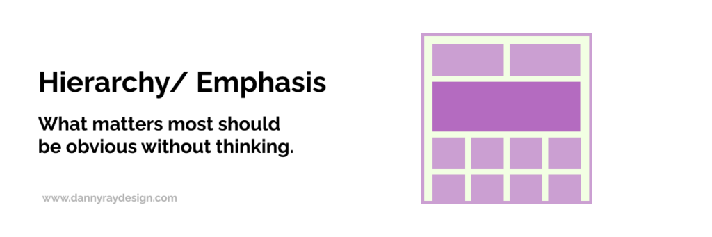
Hierarchy creates clarity by showing users what matters most without effort. In product design, users shouldn’t stop to decide where to look or what to do next. The interface should guide them, making primary actions obvious while supporting elements stay in the background.
When hierarchy works, the experience feels intuitive because attention flows naturally. When it breaks down, users hesitate — even briefly. Over time, those moments compound and make a product feel less efficient and less trustworthy.
Competing priorities often cause this breakdown. Teams elevate promotions, features, and calls to action at the same time. Everything gets equal emphasis, which creates noise. Instead of being guided, users must decide what matters.
AI can amplify this issue. It generates layouts quickly but doesn’t determine priority. Without direction, it assigns equal weight to elements. To fix this, teams must actively decide what matters most and design around it. When everything is emphasized, nothing stands out.
Ask yourself:
Where does the user’s attention go first — and is that intentional? Are you clearly prioritizing one primary action, or asking users to decide what matters?
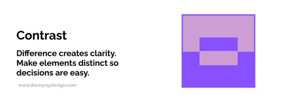
Contrast creates distinction and helps users act quickly. It allows them to differentiate elements, understand states, and recognize what’s actionable. In product design, contrast shows up in buttons, typography, color, spacing, and interaction states.
Most designers understand contrast well, especially because it’s tied to accessibility standards like ADA compliance. But contrast goes beyond compliance. Strong contrast makes interfaces clear and scannable, while weak contrast forces users to work harder.
Contrast also extends beyond color. Size, weight, and spacing all contribute. Negative space plays a critical role by giving elements room to breathe and reinforcing what matters. When used intentionally, it improves clarity and introduces calm.
AI-generated layouts often look polished but lack intentional contrast. Elements share similar weight, and layouts feel compressed. Designers can solve this by increasing separation through space, scale, and hierarchy. Contrast isn’t decoration — it’s a functional tool that reduces cognitive load.
Ask yourself:
Do key elements stand apart clearly, or do they blend together? Can users instantly tell what’s actionable without searching?
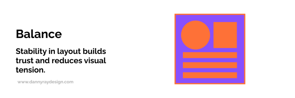
Balance creates stability by distributing visual weight across a layout. It influences whether an interface feels calm or chaotic.
When balance works, the interface feels composed and easy to process. When it doesn’t, something feels off — even if users can’t explain why. That subtle discomfort can reduce trust in the experience.
AI can assemble layouts quickly, but speed doesn’t guarantee balance. More content rarely improves clarity. Dense layouts often overwhelm users instead.
Designers should manage spacing and density intentionally. Structure content to support understanding, not volume. Balance ensures users can process information without strain.
Ask yourself:
Does the layout feel calm and stable, or slightly off? Are you adding content to clarify — or just increasing density?
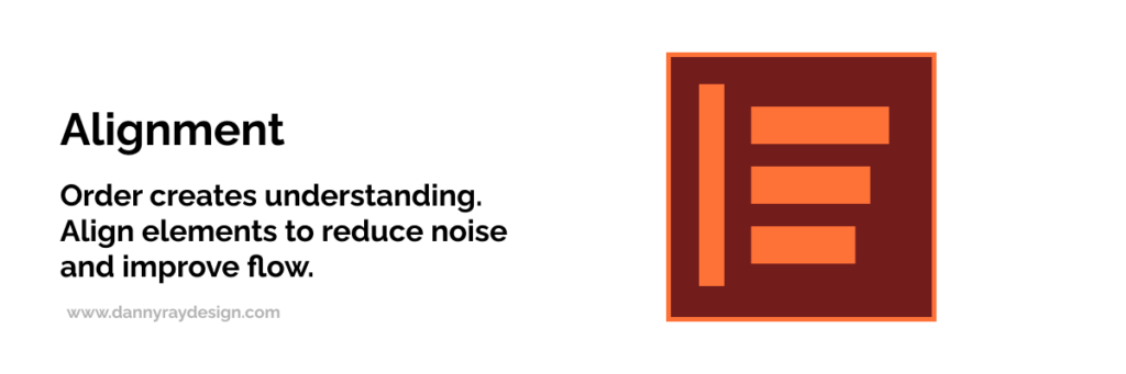
Alignment brings order and structure to an interface. It helps users scan content and understand relationships between elements. Consistent alignment creates patterns the brain can process quickly, which reduces effort.
Even small inconsistencies introduce visual noise. Elements feel disconnected, and users must work harder to interpret the layout.
AI can position elements efficiently, but it often misses precision. Small misalignments accumulate and create subtle disorder. Designers should enforce alignment deliberately to maintain clarity and confidence.
Ask yourself:
Do elements align consistently across the layout? Are there small inconsistencies that might introduce visual noise or slow scanning?
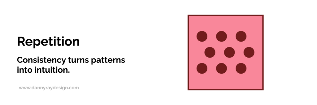
Repetition reinforces consistency and helps users recognize patterns. When users understand patterns, they move faster because they don’t need to relearn interactions.
Design systems support repetition, but only when teams apply them consistently. Without discipline, repetition breaks into variation, which introduces friction.
AI can generate components quickly, but without a guiding system, similar elements behave differently. Designers should reinforce patterns across screens. Consistency turns familiarity into efficiency.
Ask yourself:
Are patterns consistent across screens, or do similar elements behave differently? Are users learning once — or relearning as they go?
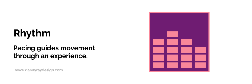
Rhythm creates flow by controlling how content unfolds across an experience. Spacing, grouping, and sequencing shape how users move through an interface.
When rhythm works, users move naturally from one moment to the next. When it doesn’t, the experience feels abrupt, cluttered, or overwhelming.
AI can place elements efficiently, but it doesn’t always create a natural cadence. Designers should structure content intentionally and break information into digestible segments. Rhythm ensures experiences feel coherent and easy to follow.
Ask yourself:
Does the content flow naturally from one section to the next? Are you pacing information in a way that feels digestible — or overwhelming?7. Unity
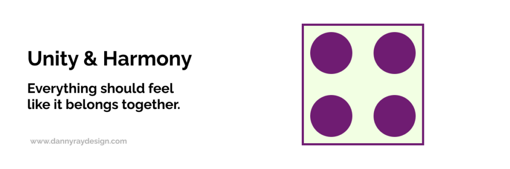
Unity creates cohesion by ensuring all elements work together as a whole. When unity is strong, the experience feels seamless and trustworthy.
When unity is weak, interfaces feel fragmented. Even if individual components function well, the overall experience feels inconsistent.
AI-generated interfaces often struggle with unity, especially without a cohesive system. Designers should anchor their work in a unified design system to ensure consistency. Unity transforms parts into a product.
Ask yourself:
Does the experience feel like a cohesive whole, or a collection of parts? Do all elements reinforce the same system and visual language?
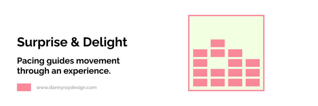
Not everything in UX fits into a principle. Some moments create emotional impact through subtle, intentional details like animation or interaction.
These moments only work when used carefully. Overuse creates distraction, while thoughtful use enhances the experience. Surprise and delight should build on strong fundamentals, not replace them.
When hierarchy, contrast, and unity are strong, these moments elevate a product from functional to memorable.
The next time you use a product, pause and evaluate it with intention. Look at where your attention goes first and whether hierarchy guides you clearly.
Notice whether elements stand apart or compete. Pay attention to balance, alignment, and consistency across screens. Observe whether content flows naturally or feels dense.
If something feels off, it usually is. The next step is identifying why and deciding what to change. Over time, this habit sharpens your design judgment.
Today’s tools — design systems, A/B testing, and AI — help teams move faster. But they don’t guarantee clarity or cohesion. They scale output, not judgment.
As design accelerates, understanding foundational principles becomes more important. Without them, teams produce experiences that function but fail to communicate effectively.
The advantage isn’t speed. It’s knowing what matters.
The best products don’t just work — they feel right. They guide attention, reduce friction, and create clarity from the first interaction.
This doesn’t happen by accident or through tools alone. It comes from applying foundational design principles with intention.
Over time, these principles evolve from rules into judgment. Designers learn when to apply them, when to push them, and when to step outside them.
Because mastering design isn’t just about following rules.
It’s about knowing when, where, and how to break them — with intention.