
During my time leading design at a major e-commerce company, one project has stuck with me: a banner test that seemed successful on the surface but ultimately revealed a blind spot in our thinking. That test helped shape my view of how modern digital experiences fall short — not because the design was bad, but because it only served the average user.
That realization started a deeper inquiry. If we could personalize content, why weren’t we evolving the experience itself?
As a design leader working at the intersection of modular systems, AI, and personalization, I’ve spent years thinking about how to better serve the diversity of real-world behaviors. This article proposes Adaptive UX as a way forward — an approach that personalizes not just content, but the experience itself. Adaptive UX leverages behavioral patterns and flexible design systems to serve different users more intentionally, helping us move beyond the limitations of designing for a single, average user journey.
In this article, I will:
Let’s revisit the project I mentioned at the top of the article, and what it revealed about how I approached this idea of adaptive user experience design.
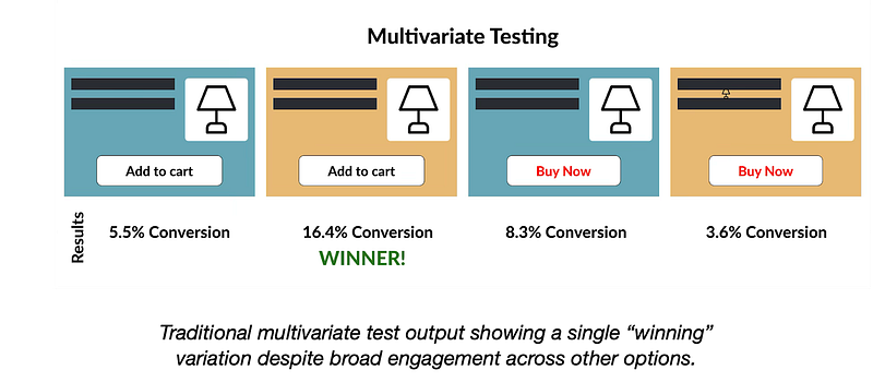
We had launched a multivariate banner test with four combinations of layout, headlines, and CTAs (calls-to-action). The winning variation drove 48% of conversions. But the remaining 52% of users engaged more with “losing” combinations — designs we ultimately discarded. Like many A/B and multivariate tests, success was defined by a single metric: click-through rate (or CTR). But metrics like clicks, conversions, or bounce rates oversimplify user engagement. That moment made it clear: traditional testing methods are optimized for a majority outcome — not to explore or accommodate the diverse ways users engage. While useful, A/B testing often overlooks meaningful insights from so-called ‘losing’ variations².
At first glance, this seemed like a content decision. We were testing combinations of headlines and images, not the layout itself. But I was accountable for all web experiences — not just the messaging, but how the site functioned and how users engaged with it across different modules. Through our analytics dashboards and conversations with our insights team, I noticed that merchandisers were frequently reordering elements on the page — moving product carousels up, shifting grids down — trying to optimize for engagement.
What struck me was this: different users were consistently interacting with different sections. Some hovered on lifestyle imagery. Others jumped straight to product tiles, carousels, or navigation links. This wasn’t just a content preference — it pointed to a structural need.
That’s when it clicked: Why were we forcing a single layout on everyone when behavioral data already told us what different users prioritized? Why did we choose either/or, when we could have offered both, tailored to behavior? We had shared user personas — research-based profiles that represent common user types and behaviors — but they weren’t meaningfully influencing how we applied our insights in design. Instead, we kept defaulting to a winner-takes-all mentality — optimizing for the average rather than leveraging the behavioral signals already in front of us.
Adaptive UX is not just a technical strategy — it’s a deeply human one. By aligning design adaptations with well-established human factors principles, we can create experiences that feel natural, intuitive, and inclusive. This includes:
These principles guide how Adaptive UX meets users where they are — both cognitively and behaviorally.
At the same time, my team and I were personalizing content — product suggestions, emails, banners — but the UX itself remained static. The layout, interaction order, and information hierarchy didn’t adapt. We had the data to differentiate, but our tools, methods, and design strategies weren’t keeping up.
Adaptive UX is an approach that evolves static digital experiences into modular, behaviorally responsive systems. While adaptive interfaces have existed in research and engineering domains for years — such as context-aware mobile apps or smart home systems that respond to environmental inputs — the role of design has often been secondary. As the Interaction Design Foundation illustrates through examples like adaptive wristwatch interfaces and sensor-driven applications, these systems introduce significant UI complexity — underscoring why designers should be involved from the outset⁶.
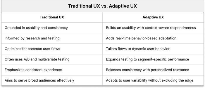
Adaptive UX doesn’t discard traditional UX principles. Instead, it builds on them.
So how do we actually begin to put Adaptive UX into practice? One answer is through a process I call Segmented Adaptive Testing or SAT.
Segmented Adaptive Testing (SAT) is the engine behind Adaptive UX. Unlike traditional A/B testing, which selects a single best-performing variation, SAT identifies which combinations work best for specific user segments based on behavioral signals such as scroll depth, click patterns, dwell time, module expansions, and engagement order. These are real-time behavioral inputs gathered through heatmaps, analytics, and usage logs — not static user demographics.
These signals may originate within the product, but they often reflect broader context — where the user came from, what device they’re using, time of day, or what task they’re trying to complete. SAT doesn’t just react to what users click — it infers patterns of behavior that connect to intent, allowing for more contextually relevant experiences. It’s a bridge between interaction and situation.
SAT systems are dynamic, continuing to learn and refine which experiences work best in near real-time — paving the way for predictive UX.

This insight is critical. Let’s take an example from FashionGo, a fictional but realistic fashion e-commerce site generating over $1 million in daily sales. The team runs a test with eight homepage variations — different combinations of headlines, layouts, and CTAs. The top-performing variant drives 38% of total clicks. Based on traditional practice, this “winner” would be rolled out to all users.
But that means 62% of user clicks were captured by other variants — options that would be discarded. If even a portion of those users convert at a lower rate when shown the “winning” design, the business impact adds up. For a site generating $1 million daily, a modest 10% drop in conversion from that 62% could cost $30,000 per day — over $10 million annually. SAT would preserve the diversity in behavior, serving the right variation to the right user segment.
These behavioral signals are far more telling than static demographics. Scroll depth shows where users lose interest. Dwell time reflects curiosity or hesitation. Click patterns and module expansions reveal what truly captures attention. Together, they tell a story of intent — and give us the opportunity to design for it.
That’s not just good UX — that’s business-critical design strategy.
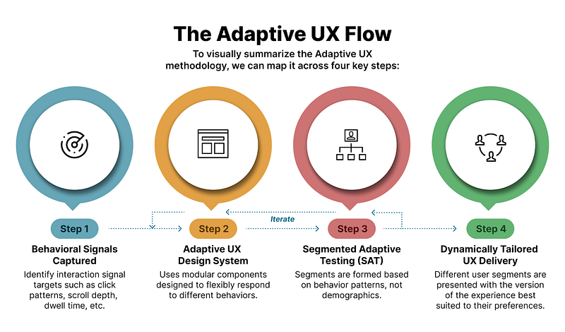
To help visualize the full process, the diagram below summarizes Adaptive UX in four key steps:
Returning to the FashionGo example, users who dwell on imagery and scroll minimally might convert best with a bold, image-led layout and a CTA like “See What’s New.” Users who engage with reviews and product specs respond better to a dense, detail-first layout and a CTA like “Handpicked for You.”
Adaptive UX supports both — delivered based on behavior.
To enable this, systems must be modular. Designer Brad Frost, on his website atomicdesign.bradfrost.com, introduces Atomic Design — a methodology for breaking interfaces into reusable building blocks like buttons (atoms), card layouts (molecules), and full-page templates — allow us to create flexible components that can be reordered, emphasized, or suppressed based on behavioral logic9. This builds the foundation for scalable adaptation.
Not every user interacts with your site the same way. Some skim, some dig deep, and some just want to know what everyone else thinks. So why give them all the exact same layout?
That’s where behavioral archetypes come in. These aren’t hard-coded personas — they’re recurring engagement patterns that emerge in how users interact with different content types. For example, in the following PDP mockup, one might apply these simplified archetypes to Product Detail Pages (PDPs):

These archetypes are not necessarily dynamic — what shifts is the user’s movement between them, influenced by factors like product category, context, or even time of day. Adaptive UX responds in real time by adjusting structure based on live behavioral signals. The archetypes themselves are grounded in research and analytics and may evolve over time, but they’re designed to provide stable reference points. To make this practical, teams need a shared framework — a common structure, language, and tagging system — to consistently interpret behavior. This allows for scalable personalization that’s both intentional and adaptable, with future opportunities for automation as technology matures.
Adaptive UX also enhances accessibility. By streamlining interface elements, it reduces visual and cognitive noise. This is especially beneficial to neurodiverse users, users with cognitive impairments, or those relying on screen readers.
From an inclusion standpoint, it aligns with the principle of designing for the margins. One-size-fits-all often fails those who interact differently. Adaptive UX welcomes variability — what Jon Kolko describes in Well Designed as a “design-led process [that] embraces outliers and the implicit risk associated with celebrating eccentricities.”10 By doing so, we not only support edge cases but improve the experience for everyone.
And for small teams? Start with giving users control. Allow them to choose between a list view and a carousel. Let them turn off distracting modules. Like e-commerce “shelf” toggles, even minimal choice boosts satisfaction.
Adaptive UX doesn’t require AI-heavy infrastructure on day one. A simple template with behavior-based layout logic is enough to get started.
A common critique of adaptive systems is that they erode consistency. Won’t users be confused if layouts change?
Not if we adhere to Jakob’s Law⁵. Core navigation and patterns remain familiar. What changes is emphasis — elements surfaced based on need. This increases user trust by making interfaces feel more responsive over time.
Cognitive Load Theory⁷ shows that users only process so much at once. By hiding rarely used elements or simplifying pages based on behavior, we reduce friction. A “Compare Sellers” module might collapse for one user and expand for another. That’s not inconsistency — it’s contextual relevance.
Importantly, Adaptive UX doesn’t replace A/B or multivariate testing. It builds on it. Rather than picking one version to serve all, Adaptive UX takes what worked for different people — and scales it.
If Adaptive UX represents a shift in mindset and methodology, what does that mean for practice?
The takeaway: Adaptive UX blends foundational human factors with emerging tools to create flexible, responsive systems that serve people — not just patterns.
That early banner test showed me what we were missing. We were optimizing parts — images, headlines, CTAs — but locking users into a rigid structure. We had the tools to personalize content, but not the experience around it.
Adaptive UX bridges that gap. It makes the experience itself personal, modular, and intelligent. As UX Magazine puts it, “AI and machine learning are changing the way we design,”⁸ enabling systems to adapt to user behavior — aligning closely with the principles behind Adaptive UX.
Adaptive UX isn’t just good, inclusive UX.
It’s good for the user. It’s good for the business. It’s adaptive.