Giving Assistant
B2B SaaS Checkout Integration
Discover
Background
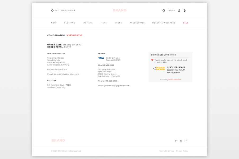
As Head of Design at Magnus Idea, I partnered with Giving Assistant to support a new product initiative—bringing direct donation capabilities into the checkout experience.
I led a small design team while remaining hands-on, developing prototypes that brought the product to life—supporting both engineering implementation and sales conversations with prospective partners.
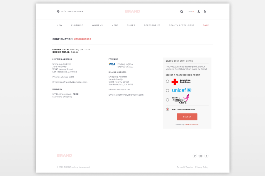
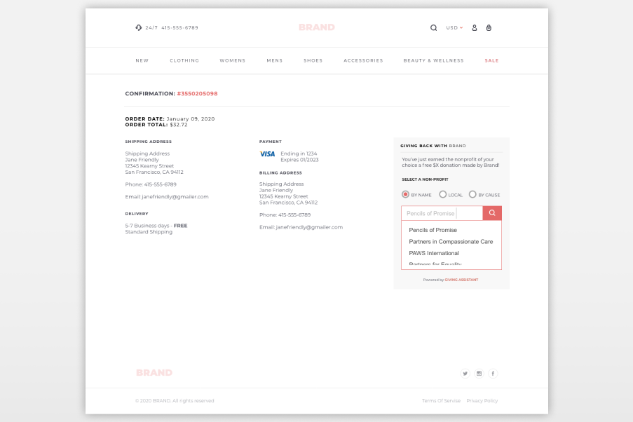
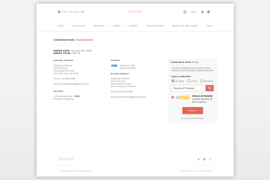
The goal was to make giving more immediate and accessible, while creating a product that worked as both a seamless experience and a compelling partner solution.
Date: 2021
My Role: Head of Design, Magnus Idea LLC.
Contributions: Led UX & Product Design Execution
The Problem
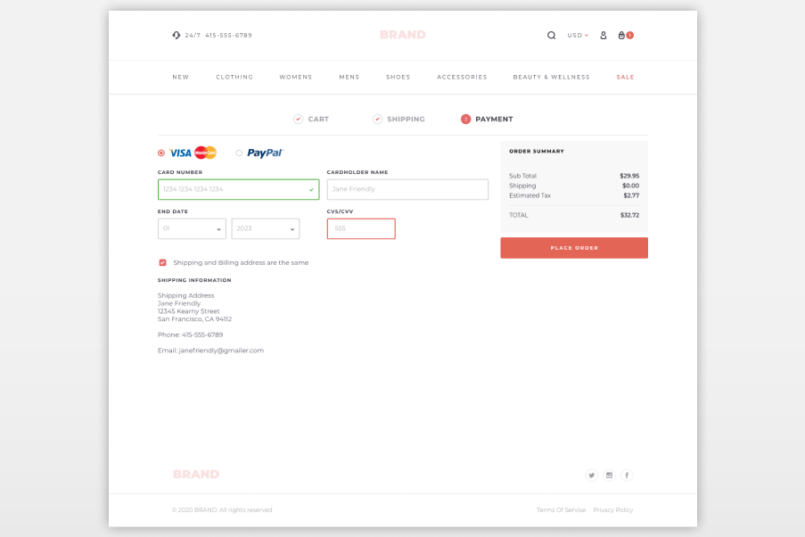
The existing experience wasn’t designed for checkout integration or partner scalability, and introducing rewards and donations into checkout created risk—any added friction could impact conversion.
How might we design a flexible, white-label checkout experience that supports partner integration, maintains user trust, and functions as both a product experience and a sales tool?
Approach
Given the compressed timeline, the focus shifted toward making deliberate tradeoffs to maximize impact quickly rather than following a traditional end-to-end process. A system-first mindset guided the work—leveraging familiar eCommerce patterns to move quickly while grounding the experience in established user behavior.
At the same time, the product was positioned as a dual-purpose system—supporting both a seamless checkout experience and a compelling solution for partners. White-label scalability was treated as a core constraint from the start, ensuring the system could flex across multiple partner environments.
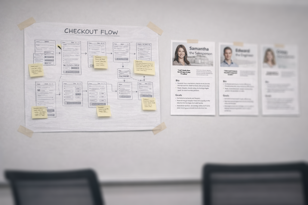
Research Methods
- Audit of existing checkout flows and user experience patterns
- Stakeholder interviews across product, engineering, and commercial teams
- Review of partner integration requirements and technical constraints
- Competitive analysis of checkout and rewards experiences
Constraints, Risks & Blind Spots
- Introducing friction in checkout could negatively impact conversion
- White-label flexibility risked creating inconsistent experiences
- Limited time to validate across multiple partner implementations
- Balancing business goals with user trust in a critical moment
Design
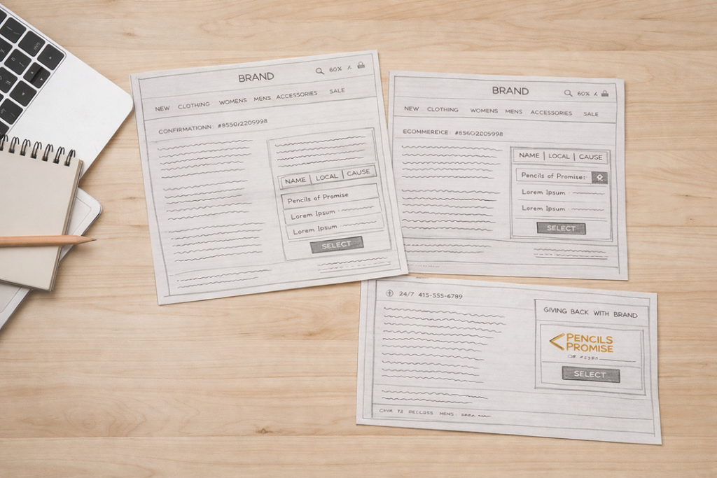
Ideate
Early exploration focused on layout, hierarchy, and modular structure and less about “styles”—defining how the experience could scale across partner environments while maintaining clarity and trust. Quick sketching was used to surface constraints and resolve challenges early before moving into digital work.
The team was directed toward a flexible, modular approach that balanced usability with adaptability, ensuring the experience could support both user needs and partner requirements without creating fragmentation.
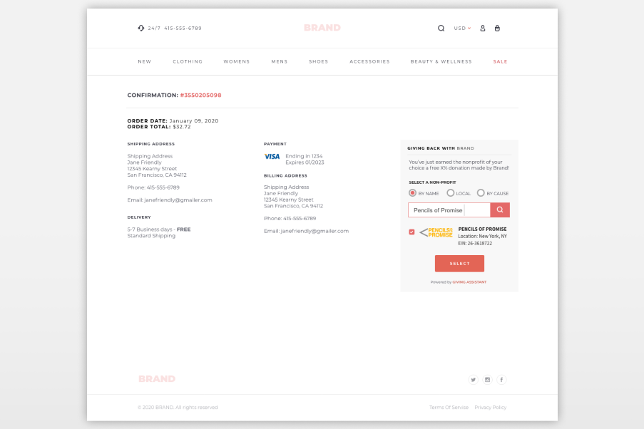
Prototype
High-fidelity prototypes were developed to validate the experience and bring the product to life. This work remained hands-on where needed, ensuring the system held up in real scenarios while maintaining alignment with the broader design direction.
These prototypes extended beyond validation, supporting engineering alignment and acting as a key sales tool to demonstrate the product’s value to prospective partners.


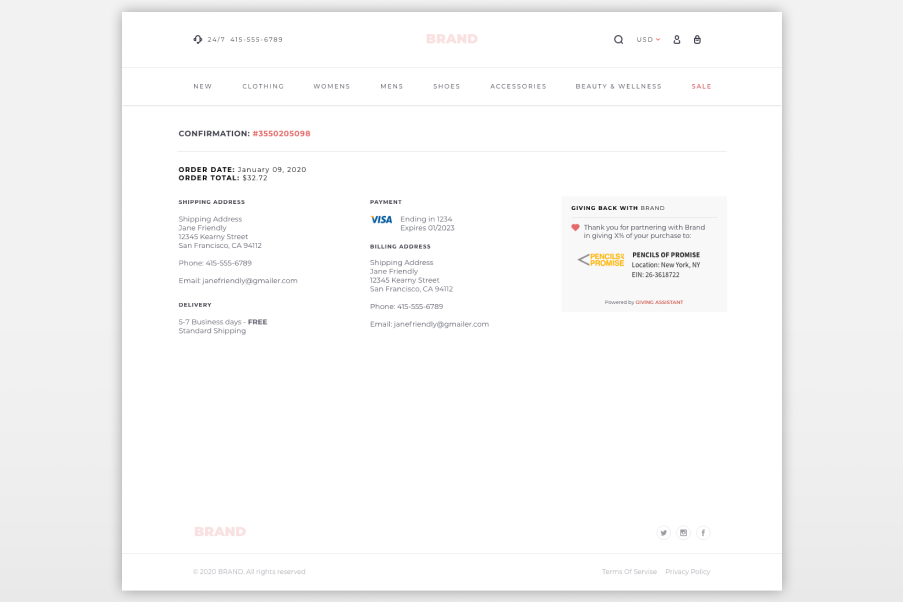

Develop
Test
Validation focused on introducing rewards and donation features without disrupting the checkout experience. The work prioritized clarity and minimal friction within a high-stakes moment for users.
Iterate
Refinements were guided by feedback from internal teams and partner conversations, balancing usability, flexibility, and business needs. The system evolved in context, ensuring it remained both practical and scalable.
Implementation
Close partnership with engineering ensured the system translated effectively across partner environments and technical constraints. The focus remained on maintaining consistency while enabling flexibility for different implementations.
Findings
Results
- Increased sales presentations by ~3x
- Enabled new B2B partnerships through a scalable white-label product
- Improved clarity and trust within the checkout experience
Learnings
Designing within checkout requires restraint—every element must justify its presence without disrupting conversion.
Positioning the product as both a user experience and a sales tool proved critical, aligning product, engineering, and business goals around a shared outcome.
Opportunities
- Further standardize the white-label system while maintaining flexibility
- Expand documentation for partner implementation and scaling
- Strengthen integration between product, sales, and engineering
- Continue optimizing for conversion while introducing new features